Fitness Bar sakhnin

Custom template design and UX/UI system development in clean code."

FBS
FBS
FBS
FBS
FBS

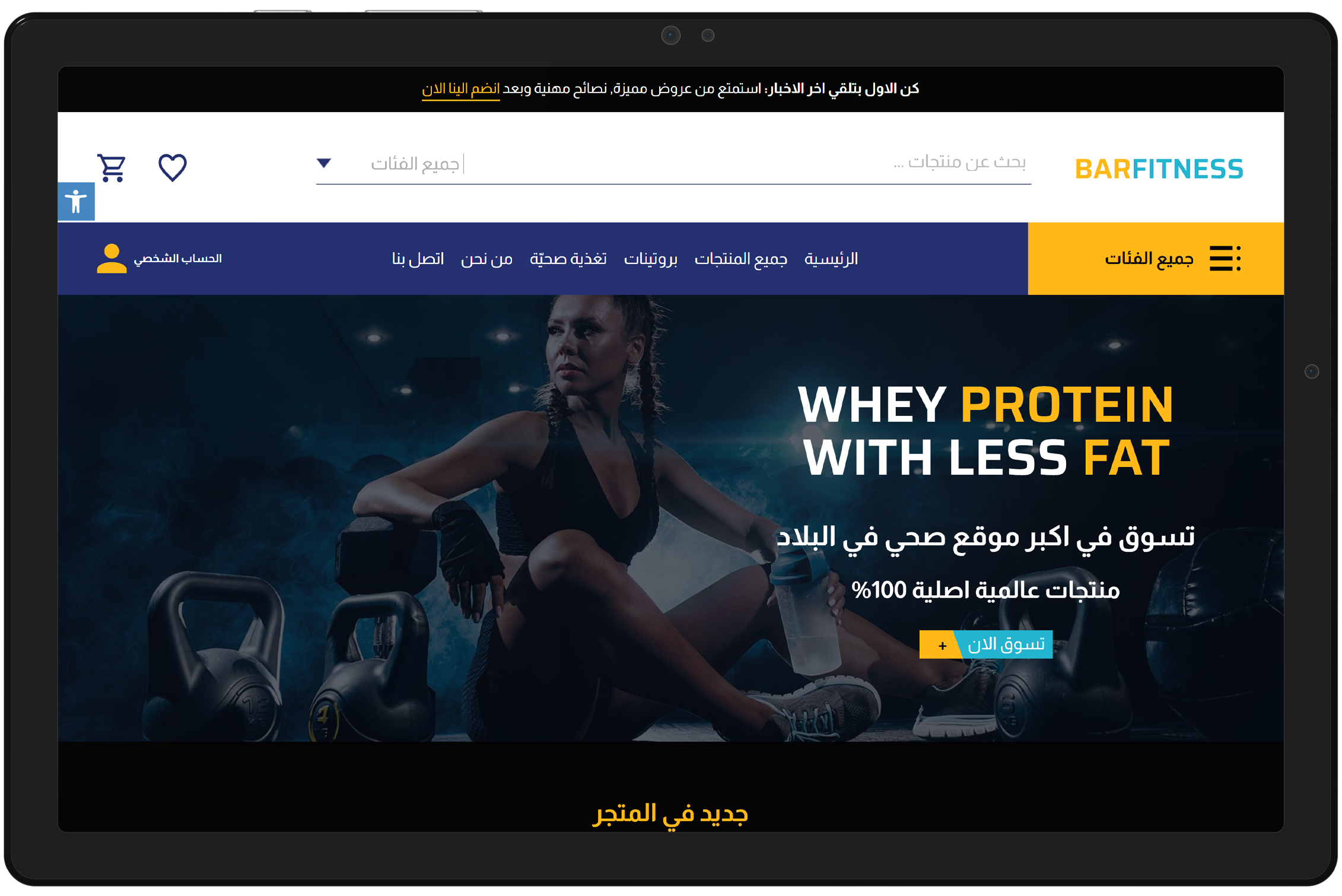
Engaging Home Page for Fitness and Health Products

Highlighting Promotions and Quick Access to Product Categories

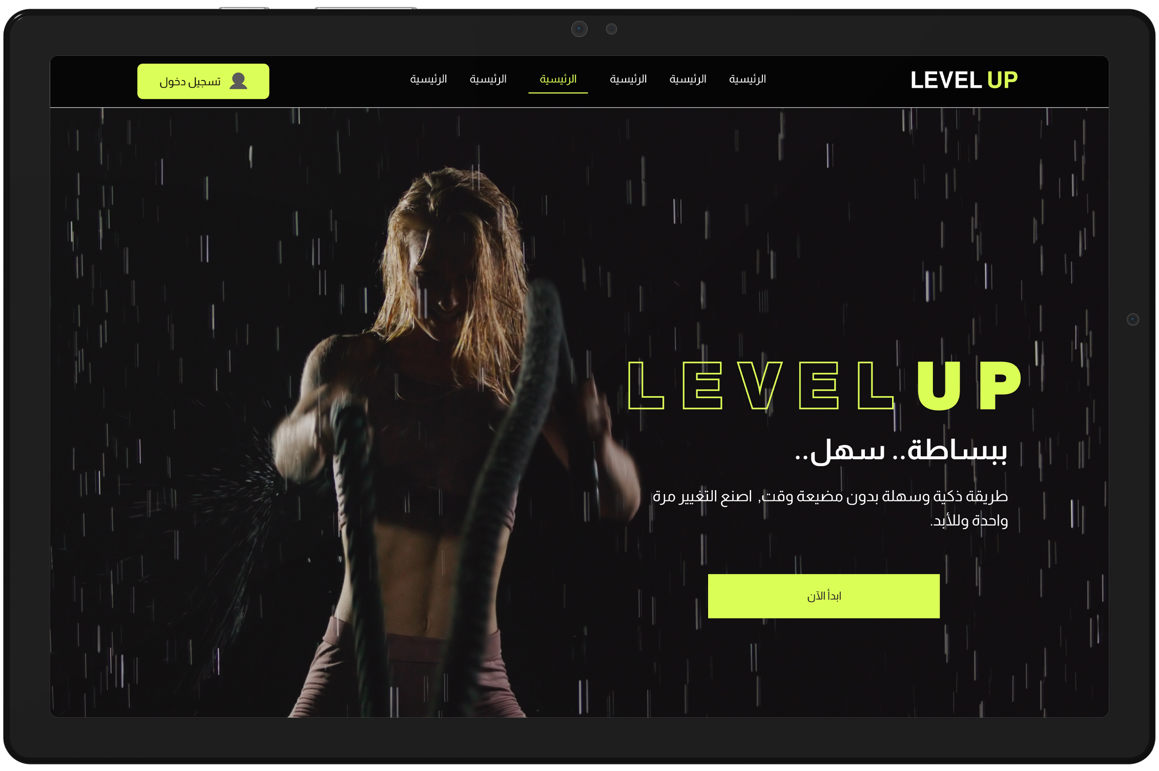
The homepage was designed to immediately engage users with a strong visual header promoting fitness products like whey protein. Large CTA buttons encourage users to start shopping or sign up for more updates. Additionally, a navigation bar allows easy access to different product categories and account management options.

Design Thoughts:

We utilized impactful imagery and bold typography to create a memorable first impression. The goal was to combine functionality with aesthetic appeal, ensuring that users can navigate quickly while being inspired by the fitness-focused visuals.

FBS

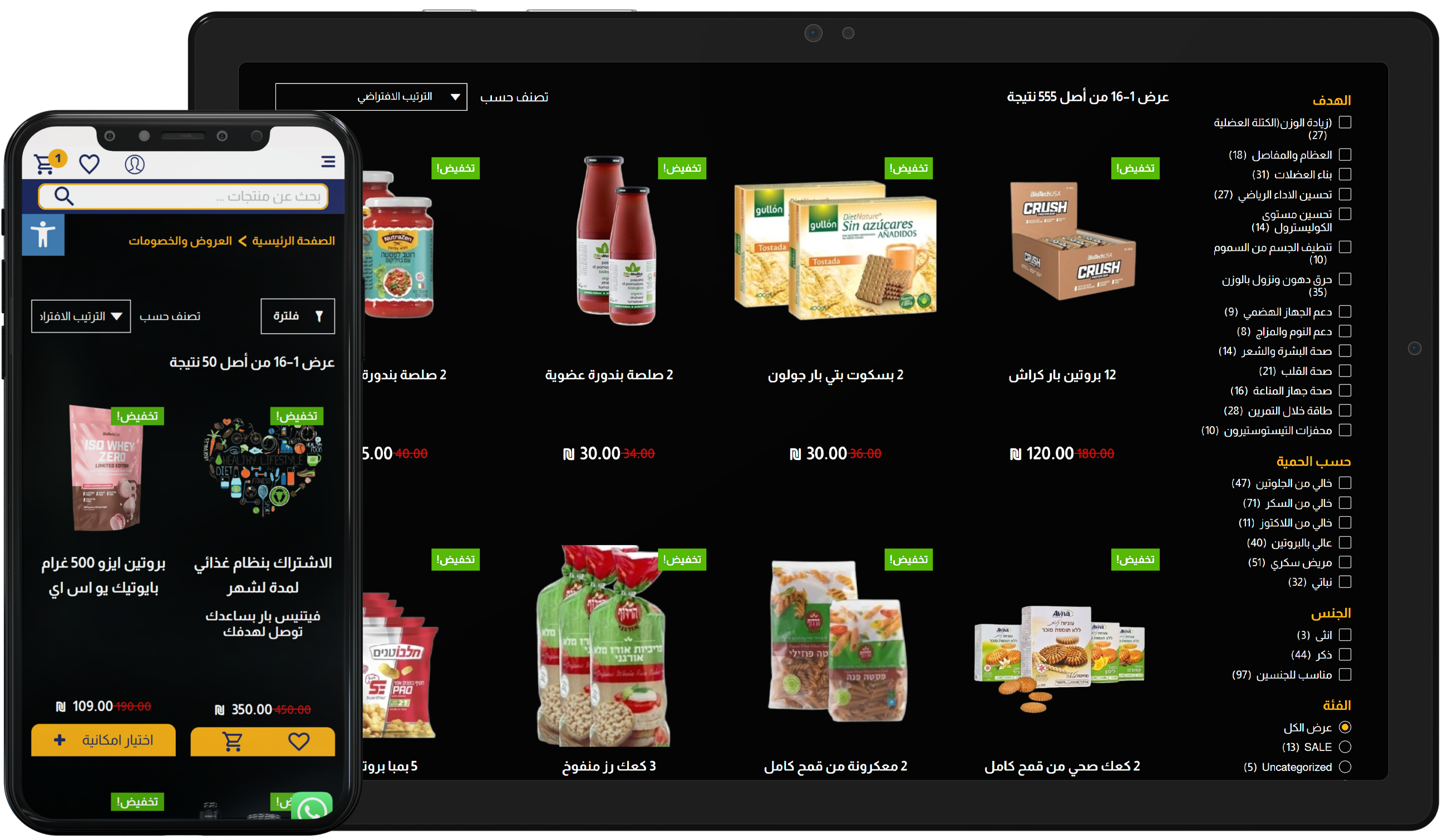
Product Selection and Categorization Optimization

Seamless Product Browsing and Quick Selection for Fitness Enthusiasts

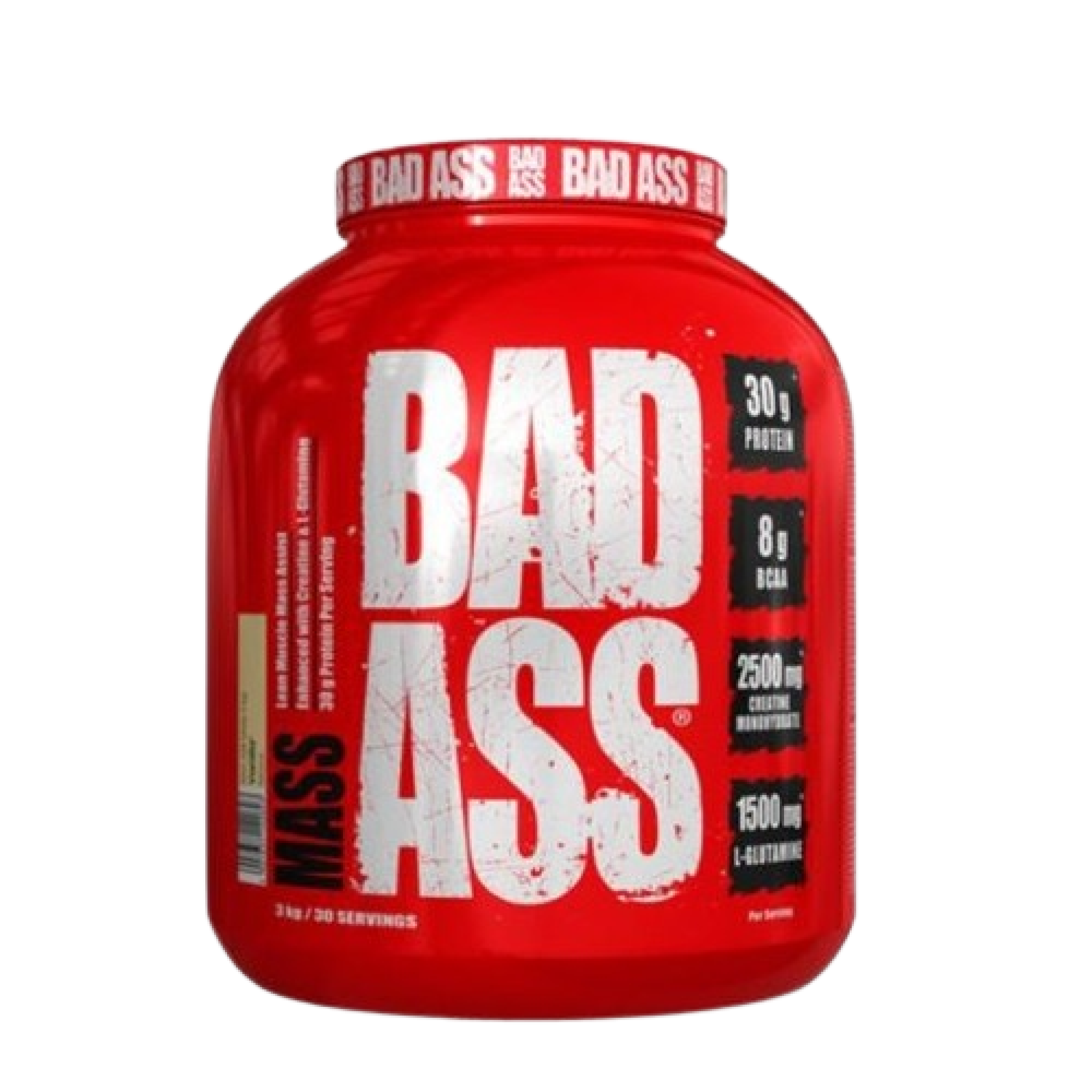
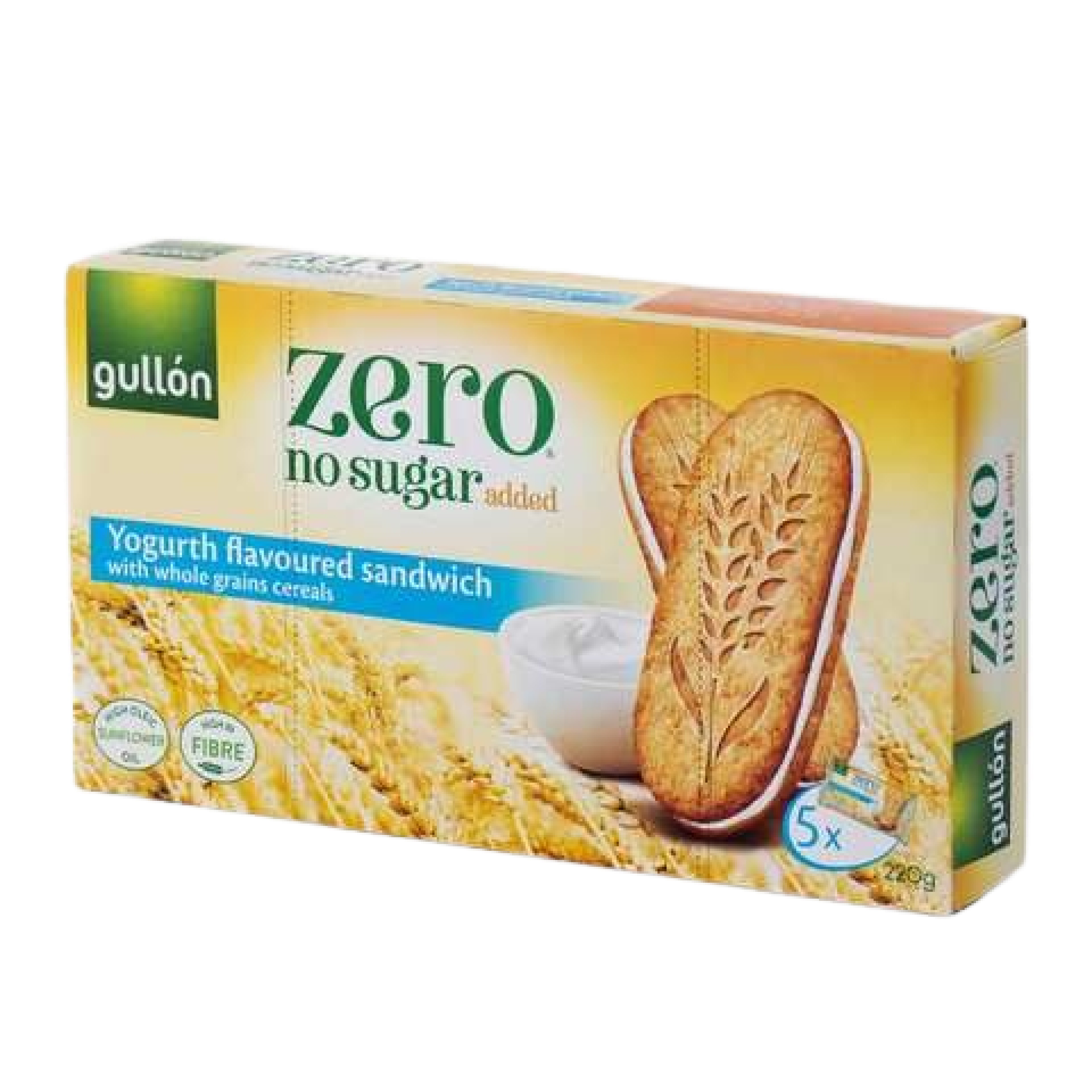
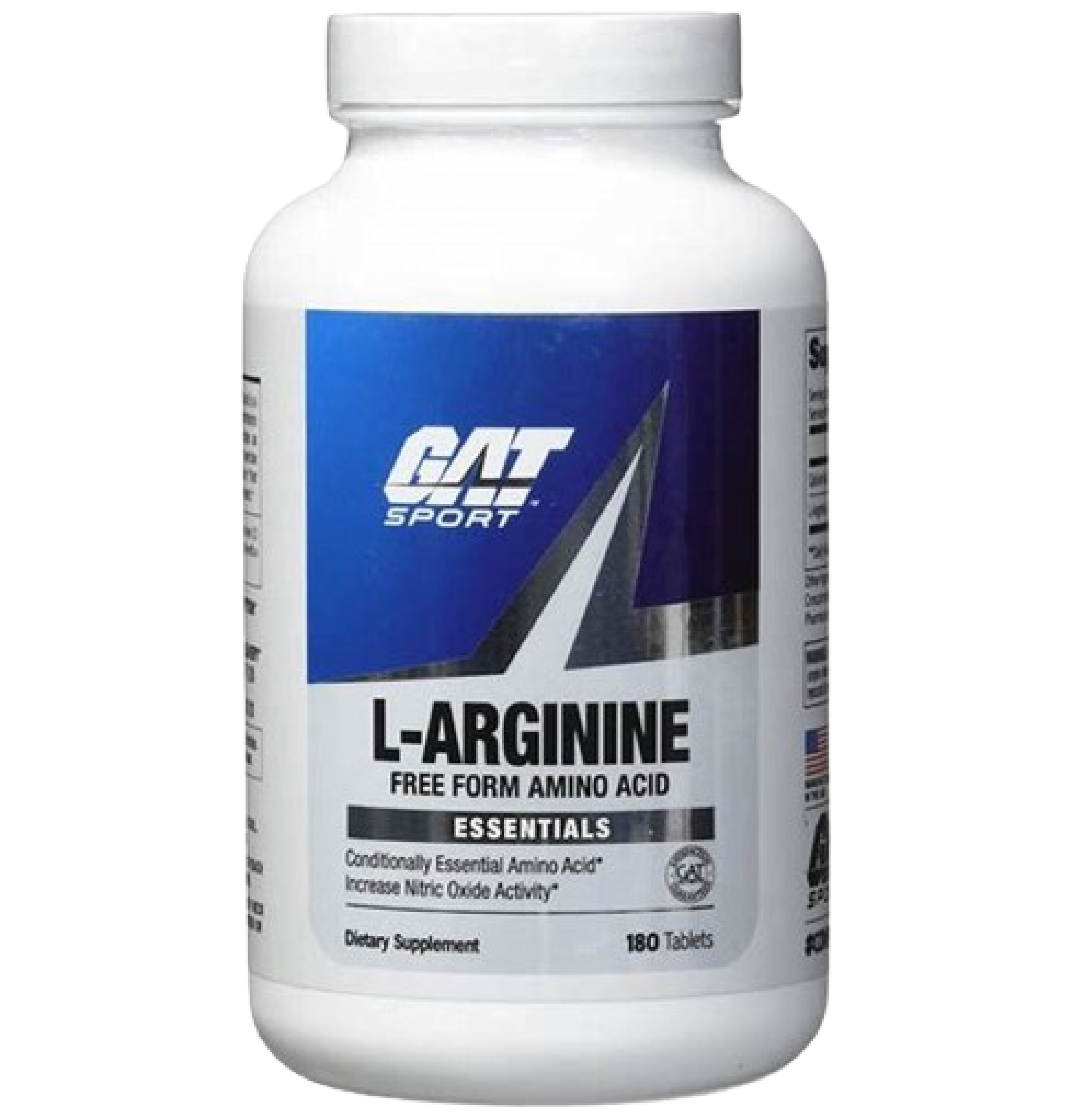
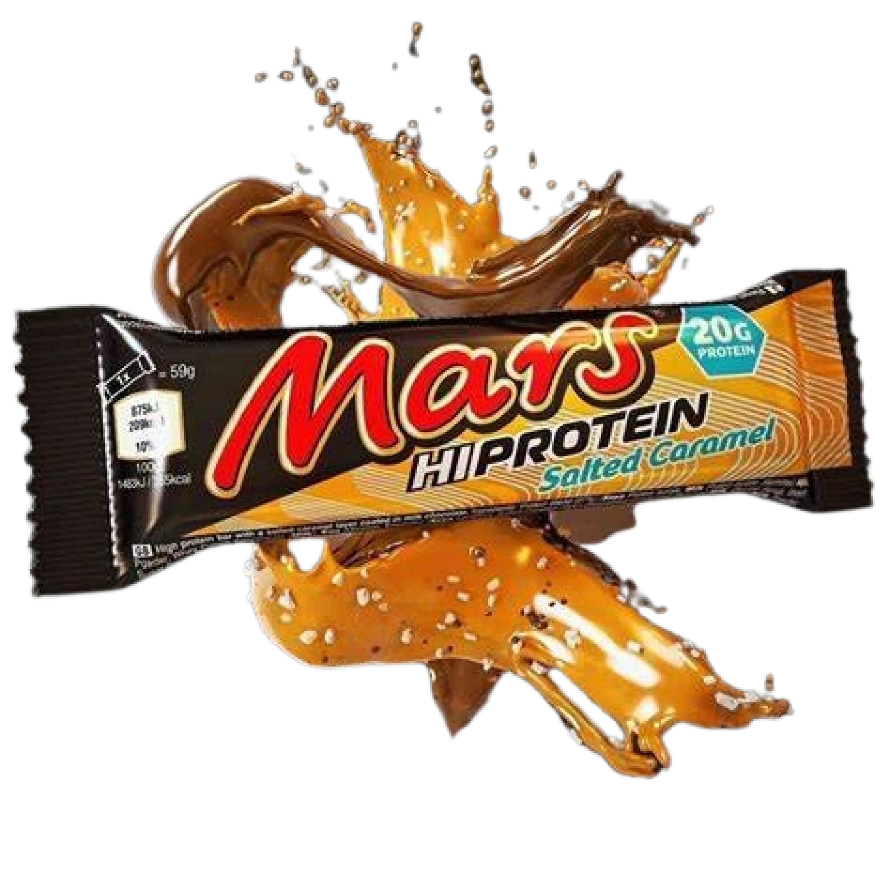
We enhanced the mobile user interface by introducing clear product categories, allowing users to quickly navigate through offers, health supplements, and nutritional products. Each product is shown with a discount tag to attract attention and promote purchasing decisions. Quick filtering options are integrated to enable effortless sorting based on user preferences.

Design Thoughts:

Our design focused on simplicity and usability, ensuring that users could find what they need without any hassle. We emphasized clear visual hierarchy with bold product images and readable text. The use of contrasting colors for prices and discounts ensures maximum visibility for promotional offers.

FBS

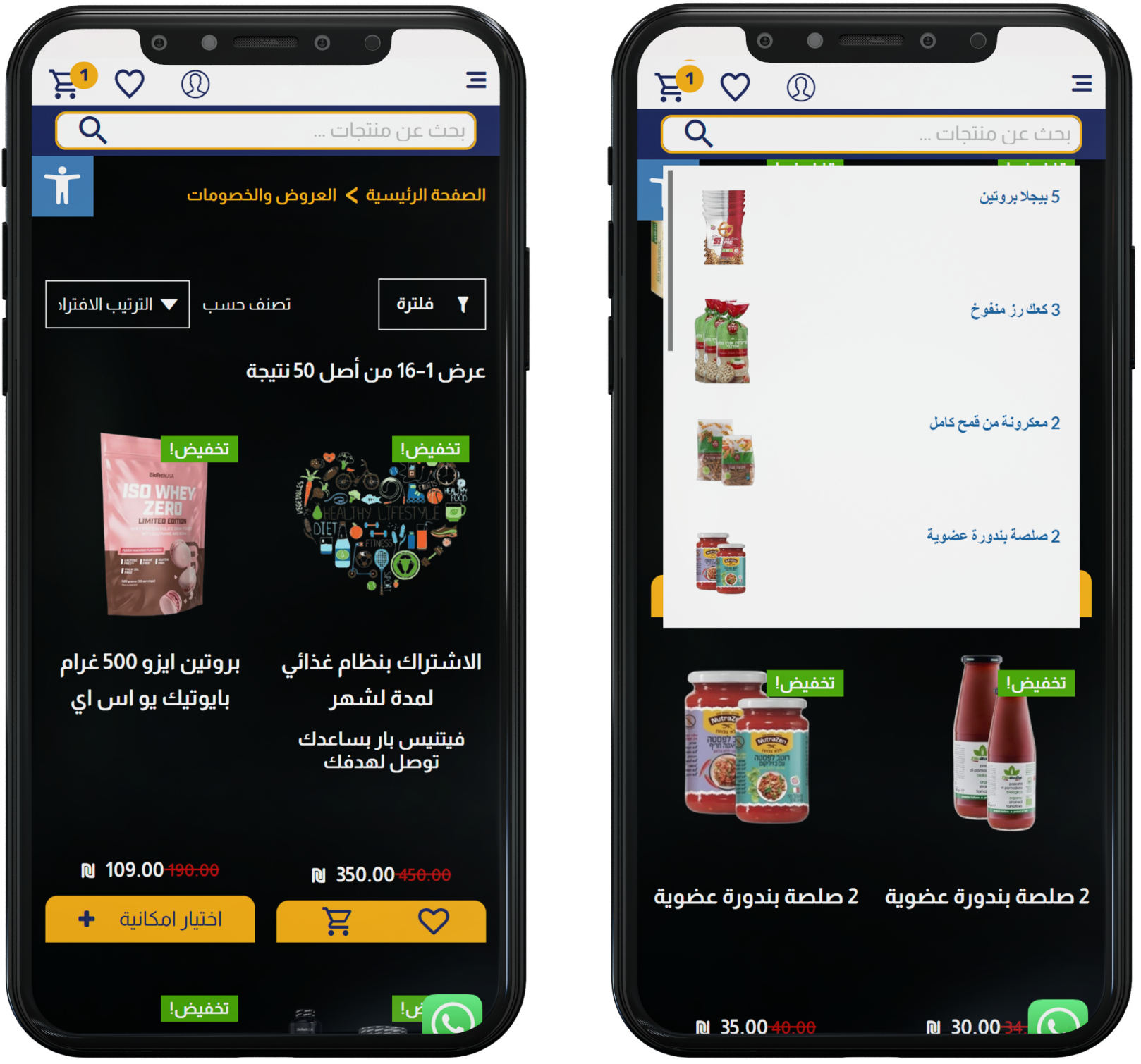
Optimized Product Filtering for Mobile Users

Allowing Users to Customize Their Search for Fitness and Health Products

We designed an intuitive filter system on mobile that allows users to sort and refine their search results based on categories, price, health goals, and more. The filter menu is easy to access and ensures that users can find exactly what they are looking for without unnecessary scrolling. This design also highlights essential offers and discounts through color coding and clear labels.

Design Thoughts:

Our focus was on creating a streamlined and user-friendly experience for mobile users. The filtering system is neatly tucked away but easy to expand, providing full control over the product selection process. We emphasized simplicity while ensuring that the key elements, such as discounts and health categories, stand out.

FBS

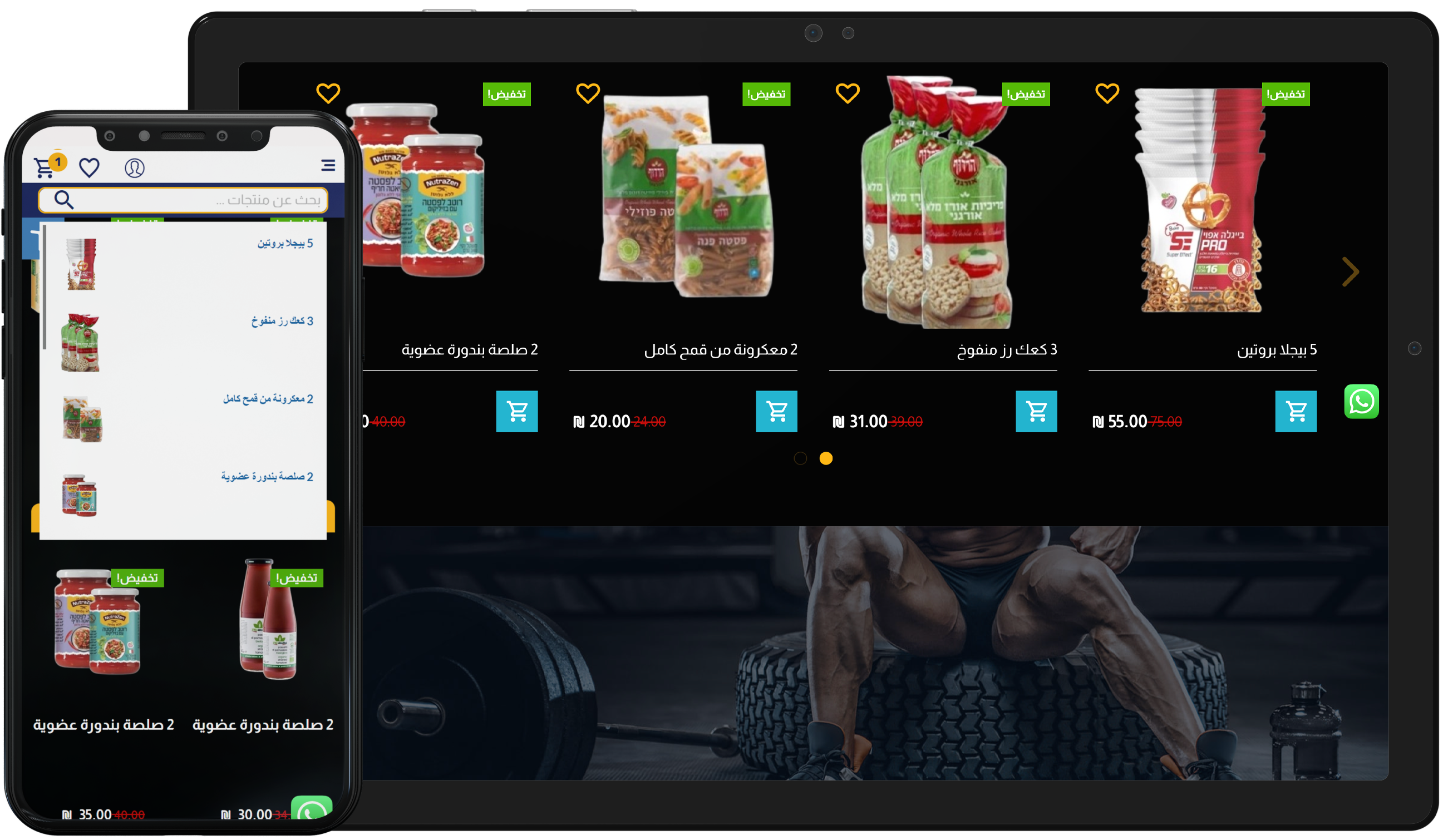
Visual Search and Menu Navigation

Streamlining the Search Process with Product Images and Easy-to-Navigate Menus

We revamped the search function and menus by incorporating product images directly into search results and navigation categories. This approach helps users quickly identify products they are looking for, improving both the speed and accuracy of their search experience. The menus are organized in a clear, hierarchical structure, with intuitive filters for narrowing down results. The integration of product images with names in both search and menus minimizes decision fatigue, making the selection process more efficient.

Design Thoughts

Our design team focused on enhancing the search process by making it more visually intuitive. Including images with product listings helps users instantly recognize what they are looking for, making the experience more engaging and faster. The clean, well-structured menu system ensures that users can navigate the platform seamlessly, while the use of images reduces cognitive load and supports quicker decision-making.

FBS

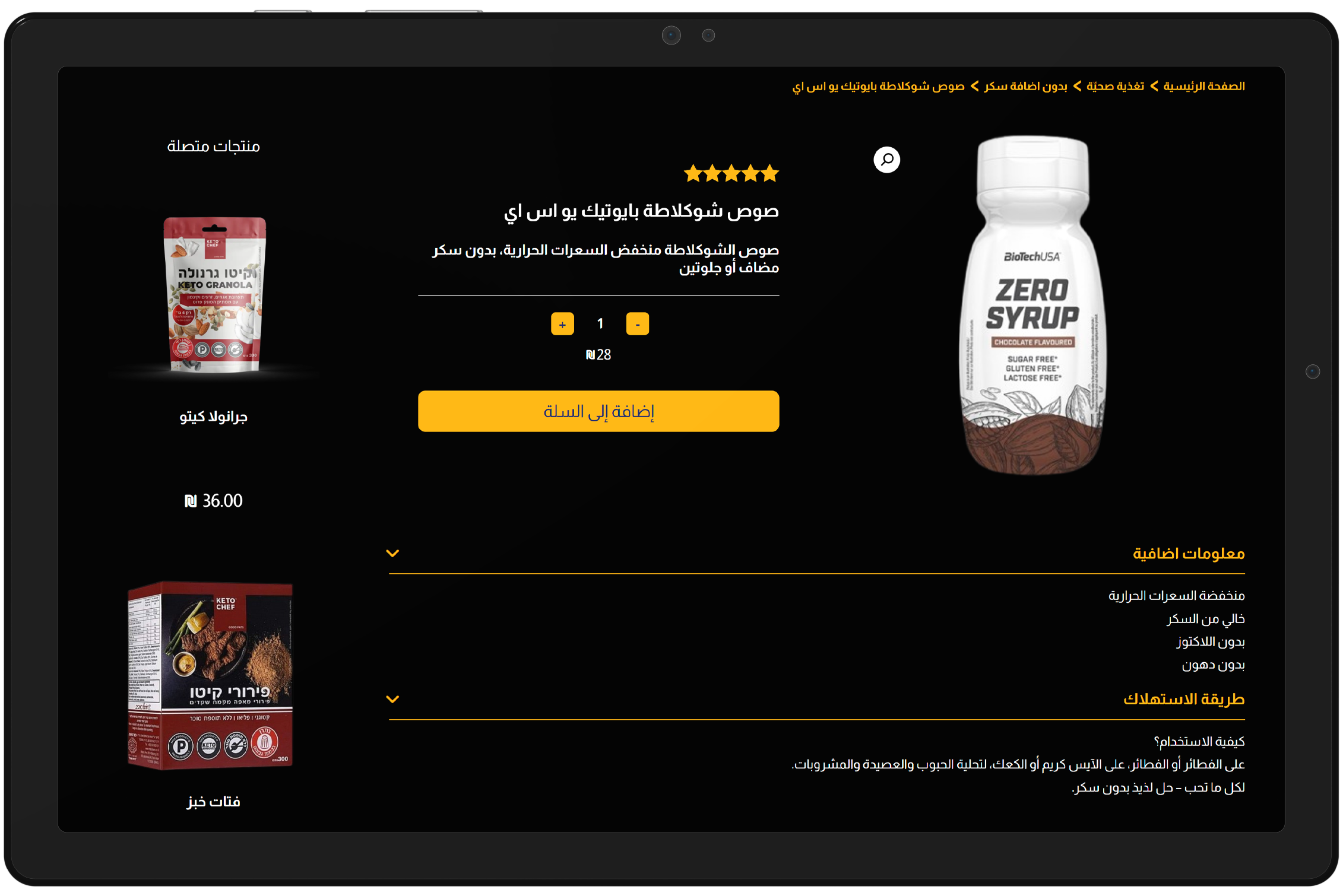
In-depth Product Information for Informed Purchase

Displaying Key Features and Benefits of Fitness Supplements

We designed a detailed product page with clear visuals, including the product image, pricing, and discount information. The page layout emphasizes essential product details, making it easier for users to understand the benefits of each supplement. The "Add to Cart" button is placed prominently for quick action, streamlining the purchasing process.

Design Thoughts

The layout was created with clarity and purpose in mind. We focused on high readability, large call-to-action buttons, and relevant product descriptions. Visual appeal was enhanced using a minimalist design, while maintaining all crucial details for the user.

SO? Can we start discussing your project?